Thursday, 6 December 2012

Idents


Station identification is the practice of radio or television stations or networks identifying themselves on air. For example a picure, either still, or moving, with the name of the company with it- the aim of idents is to get the viewer recognising names and idents woith eachother, aswell as films and trailers.

Films, radios and televison stations all have idents. For example in television is the bbc. The history of BBC idents begun in the early 1950's, they began by showing a logo inbetween programmes and as new technology has become available, these devices have evolved from simple still black and white images to the sophisticated full colour short films seen today. With the arrival of digital services in the United Kingdom, and with them many more new channels, branding is perceived by broadcasters to be much more important, meaning that idents need to stand out from the competition.

A famous ident from the film industry are production companys such as Warner Brothers and Paramount pictures. The ident is the short clip at the beginning of the film, or trailers, this advertises and shows the audience who the Production Company for the film is. This gives the company its reputation, as the auidence will judge them on the standard of the film, also on the other hand, more people will trust and would be more likely go to a film which was funded by universal because it is well known and has a good reputation.

Images of Warner Brothers idents:


Thursday, 22 November 2012

Costume list

There are four characters in our trailer, Me Chris and Nathan and Josh. Here is the costume list of what we will be wearing through out the trailer:

Me: I will be wearing a white t shirt with prints on, jeans and trainers aswell as a red zip up tracksuit top. We decided I would wear these ‘casual’ clothes as we wanted to make the film seem as though we were teenagers, as we are aiming for it to be a classic teen horror film.

Chris: Chris was dressed a bit more formal than me, wearing jeans, a polo shirt, grey cardigan and shoes. He still looked like a teenager however he seemed to look more clever and professional than me and nathan.

Nathan: Nathan wore a printed t-shirt, jeans, and trainers with a hoody. We all wore normal everyday clothes to give the impression to the viewer that we are all normal every day stereo-typical teenagers.

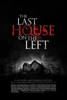
Josh: Josh was the ‘ghost/baddy’ and he wore all black to make him seem more creepy. This was a black jumper, black pants and black shoes. This is a typical evil thing to wear in horror films, for example ‘Scream’ and most of the bad characters in the last house on the left also wore black.

We had to look like normal teenagers in order for our film to be as effecitve as possible as our film is aimed for, and target at teenagers/twenty-something year olds, we all did however want out own identity in the film which is why we all dressed as different types of teenagers. For example i had a tracksuit top on, nathan had an 'indie' looking t shirt on, and chris looked more formal. This enabled us to get the idea across in the trailer that although we are all teenagers we are not all the same and in the film/trailer we can be sepparated and recognised by our clothes.

Props list

For the trailer we will be needed quite a few props. Here is a list of the props we will use:

-Tourch
-Doors
-'Ouija board'
-Small Glass
-Ladder

We will need these props because we need to make our film look as real as possible, we used the tourch as one of our characters has it because all of the lights go off and it is dark. We needed the doors as there is one scene were they are opening and shutting, we needed the Ouija board as the three friends are seen to be playing it before all of the comotion happens. They need the small glass to play the game and also we needed a ladder because there is a scene were it is the main feature.

Magazine front cover mock ups

There are my magazine front cover mock ups, i first of all made this one:

 And i didnt really like the layout. I thought having too many pugs at the top would make the front cover look like too much was going on. Then i made this one:

I liked this one alot better as it looks plain yet effective. This is the mock up i am going to base my magazine front cover on, i think it looks professional and there isnt a lot going on when you look at it, unlike the one i did before hand.

Film poster mock ups


Here are my film poster mock ups, i made one and didnt feel it was right for what i was trying to achieve with my film poster. This is the first one i made:
 Then i came up with this mock up which i thought was much better and fitted in with a stereo-typical film poster for the genre i chose to make my trailer in.
I like this mock up the best and will use it as i like the layout, it is simple yet effective and also it includes all the right information and also looks professional. I believe the first mock up i made was too basic and did'nt look as professional as i would have liked it to.

Monday, 19 November 2012

Synopsis

A sysnopsis is a breif summary and outline of what is to be entailed, in this case the synopsis is of a classic teen horror film that we have created a trailer for.
'A group of friends having a relaxed, normal night in... who would have thought a 'harmless' game would cause such disaster and such distress? The group is soon split through paranoia and fear as the night unfolds in uncertainty and disasterous way. Who will live, and who will survive?'

Thursday, 15 November 2012

The Devil Inside- Trailer Analysis

The Devil Inside trailer starts how the actual film starts, by this i mean it starts with a blank black screen, with none diegetic sounds of a woman ringing the police to report that she had murdered three people. What he woman says shows up on the screen then vanished when she stop talking- adding more chill to the already scary, scared and depressed tone in her voice. however the viewer wouldn’t know this if they hadnt seen the film: it would be recognised if the viewer had viewed the trailer then went to see the film as the opening is so memarable.

The trailer then goes on to show medium/short cuts to give the viewer an idea of the film, the main characther appears a lot in it and it is like she is telling her story to the viewer of the trailer- then it goes on to show her mother in what seems to be a mental hospital, then fast cuts of excersizms and preists. This gives the viewer a large idea about what that the film entails however doesnt give t much away which is a key point to every trailer, as if they give too much away people will feel like they dont need to see the film. Then at the end of the trailer comes the release date and the actual name of the film, which doesnt feaure once before the ending of the trailer.

There is an image that appears on the trailer, and it is a stills image from the film. This picture is associated with the film and is very recogniseable. It is a picture of her mum pulling down her bottom lip and revealing a cross cut in to it. The creators knew his image would be memerable which I why I think they decided to use it a lot whilst promoting the film, as it features on the film posters, DVD contents and also the trailer.

The trailer:
http://www.youtube.com/watch?v=-VIyO9UlnJ0

Wednesday, 14 November 2012

Harry Potter And The Deathly Hallows- Part 1 and Part 2

This post will be an anlysis of Harry Potter And The Deathly Hallows Part One and Harry Potter And the Deathly Hallows part 2, I will talk about part 1 first. The first installment of the two-films Harry Potter and the Deathly Hallows part 1 follows Harry, Ron, and Hermione as they search for the pieces of Voldemort's soul that he extracted from himself and put in to 'horicruxs'. If the trio is unable to locate and destroy them all, Voldemort will remain immortal and will not die, however this then courses complications, one of them is inside Harry himself. Despite Harry's, ron's and Hermione's long lasting friendship: things threaten to ruin their plans of destroying the horicrux's.

This Harry Potter and the Deathly Hallows Part 1 trailer compared to the other trailer for previous Harry Potter films (e.g. The Philosiphers Stone, The Chainber Of Secrets and The Prisoner Of Askiban), is very dark. By this i mean the mise en scene of the trailer is very dark and depressing. Compared to the other happy and 'magical' films were there is a sense of excitement- the previous films also appaled to children, wereas i believe this one wouldnt as it is more scary and i believe: aimed at adults and adolescents. This trailer gives the impression of dark magic taking over compared to light hearted magic in the previous films, and things seem to be getting more seriously, and this is then clarified as the trailer has text which says 'It is the beginning of the end' near the end.

The trailer also shows Voldermort alot in it, where as in previous trailers he didnt occur, you could just hear him or the hissing of his snake. This is another indication that the film is dark and even scary. The cuts are fast and the trailer also gives like fast forwarding of certain things, such as when Voldermort looks in to Dumbledoors coffin. This gives us the impression that there is going to be alot going on within the film, by this i mean with all the fast cuts and constant cutting to other incidents it gives he viewer the impression that alot of things will be happening in the film.

Part 2 is equally as different to the other Harry Potter trailers then part One. Part two features faster cuts and heavier mooded music, giving the view a more serious feel to the film and the feel that it is the end. The first trailer seems to have more action than the second trailer, Warner Brothers have probably done this because they wanted to give the viewers more information about the plot of the film before realsing more action. The second difference is the use of previous film scenes used in the second film.  Warner Brothers might have done this becuase they wanted to use scenes from younger years to remind the audeince and not give too much of the new film away. The first trailer and second trailer both have different sets of music, the second trailer seems to be more intest compared to the first trailer's music. The trailers differ with different shots, the second trailer uses more low angle and high angle shots and also close up's of voldermorts face. Were as the first trailer uses more natural scenes.
The trailers:
Part 1-  http://www.youtube.com/watch?v=YzfEH0UPEBo
Part 2- http://www.youtube.com/watch?v=I_kDb-pRCds

Codes, conventions and the definion of trailers

Codes and conventions

There are many different conventions within creating a successful film trailer and small film:I will explain these codes and conventions through this blog post. I will be talking about the following things:
 
-Dilogue
-Star power
-Captions
-Cuts
-Speed and smoothness of trailer
-Idents

I will use the two Harry Potter films (deathly hallows, and the deathly hallows part 2) to help me show this as I believe they are the best examples to use when talking about codes and conventions of  film trailers.

Dialogue can be used as narrations which are supported by scenes from the film and dialogue from the film it's self.  Within the harry potter trailer it used dialogue from the film itself to help promote it. 

Star power AKA The big named actors are used to draw in the audience because their favourite actor might be starring in the film. Within the harry potter trailer it used the well know actors such as Daniel Radcliff and Rupert Grint to help promote it.

Film trailers use captions to give text support to the scenes.  Within the harry potter trailers they used captions in this way to make it more informative and interesting.

Short fast cuts in trailers are used to make the trailer more fast paced and therefore more appealing to the audience, giving the film more depth and more things going on. The harry potter did the use to make it more intense and overwhelming.

The speed of a trailer varies in each one, usually this happens in trailers to make the more intense.  The harry potter trailer did this to make it more intense.

The release date of the film gives the audience more insight about the film and therefore more appealing towards the audience.  Film trailers will say used text to quote if the film will be in 3D.  Harry Potter did this to give the audeince more insight in the the plot and also of the actual film.

Now I will talk about the specialised Ident at the start of the trailer. This gives the feeling that the film is important because for a big company such as warner brothers, making a specialised Ident is great.  Harry Potter's creators did this as Harry Potter has a big target market and is a huge franchise.

There are many differences between the Harry Potter trailers, and the main differences are:

- The first trailer has more action than the second trailer.  Warner Brothers might have done this because they wanted to give the viewers more information about the plot of the film before realsing more action. 

- The second difference is the use of previous film scenes used in the second film.  Warner Brothers might have done this becuase they wanted to use scenes from younger years to remind the audeince and not give too much of the new film away.

-The first trailer and second trailer both have different sets of music, the second trailer seems to be more intest compared to the first trailer's music.

-The trailers differ with different shots, the second trailer uses more low angle and high angle shots and also close up's of voldermorts face. Were as the first trailer uses more natural scenes.


Trailer definition:

A trailer is an advertisement for a film used to encourage and advertise it to people to try and get them intregued and interested in it so they are more likely to watch it when it is released. Depending on the genre of film, trailers can be aimed at many different age groups and specific film fanatics by using various methods to attract their attention: for example a kids film would not be advertised to everyone as there would be no point, as it is intended for children and will appeal to children. Every trailer is 2 minutes and 30 seconds maximum and within that they must explain some of the plot line, show clips from the actual film, introduce characters and actors and tell people the age and release date, the aim of this is to try ad get people to watch it.

Thursday, 18 October 2012

Magazine front cover analysis


This front cover is from Empire magazine, which is a British film magazine and was first published in 1989 by Emap. The magazine has a target audience of males and females, ABC, film and cinema fans. The monthly magazine is the biggest selling film magazine in Britain.

Part of the masthead is covered up by the main image; this shows that the magazine is successful as publishers feel confident that audiences will recognise the magazine, despite part of the masthead being hidden. The masthead is in large capital letters, this is so that it stands out as much as possible. The colour red is used to represent danger. This front cover is a lot busier than the previous front cover from Entertainment Weekly that I looked at. There are conventions however that are similar on both covers. Both the mastheads are the largest text on the page and are placed at the top of the magazine.

The main image on this front cover features Heath Ledger staring as The Joker from “The Dark Knight”, his last film. Heath Ledger is a renowned actor; again this shows the magazines success. The image used is a long shot. The image represents Heath’s character to be very intimidating and reflect his character in the film. The costume used is how The Joker appears in the film; he wears bright clothes and has the iconic face paint on. He is sat with his head tilted down and his eyes are looking directly at the camera, his pose and posture add a creepy and eerie characteristic, making audiences feel threatened. Behind him is a metal gate, these could be jail bars representing his dangerous character.

Down the right-hand side are some plugs for other features that are appearing in the magazine. These will pursued audiences to buy the magazine and read the articles inside. They do not disrupt the main image or stop it from being the main focal point of the magazine. The font used for these plugs is smaller than the font used for the main headline. The three main colours used are red, green and purple. The purple and green font matches the clothes that The Joker is wearing. The bright colours represent the comic strip and grab the audiences’ attention. The red used on the masthead represents danger and blood. White is also used for smaller font so that it stands up against the dark background but down not stand out as much as the more important text such as the main headline. Other conventions are also included on the front over, such as the magazine’s website, the issue number, date and price. A barcode is also included in the left-hand corner or the cover.

The main headline “Meet The Joker” has a graffiti/comic book style font. This represents the film “The Dark Knight” because Batman was originally a comic strip. All of the front cover has a feel of a comic book, with lots of different colours and fonts. There is a strap line underneath the main headline saying “He’s a cold-blooded, mass-murdering clown”, this font looks like someone has carved it with a knife. This creates a sense of danger and edge. Above the masthead is a strapline, “The Dark Knight World Exclusive!” this gives audiences a taste of what is to appear in the magazine and links with the main headline and image. It also makes the magazine sound more distinguished and exclusive because it says “World Exclusive”. In between the strapline is the Batman logo, this has become an icon and will be easily recognised
.

Magazine front cover analysis

Total Film is Britain’s second-best selling film magazine. It is published by Future Publishing and was launched in 1997. The magazine is published once a month.

This issue features the new Sherlock Holmes film. The main image is like the one on the front of the Entertainment Weekly cover, it is a medium shot of Robert Downey Jr. as his character Sherlock Holmes. The image is very simple and doesn’t include any bright colours. As the previous front covers I have looked at, a well know actor has been featured. Robert Downey Jr. is an accomplished actor therefore creates a successful image of the magazine and he will be recognised by audiences.

Total Film’s iconic masthead is similar to that of Entertainment Weekly, because one of the words is incorporated into the other. The word “Film” is in large, white, capitalised font so that it stands out and is the largest font on the page making sure it is the most noticeable. The word “Total” is in a smaller font and is incorporated into the word “Film”; it is the same colour as the background so that it looks like it has been cut out. The word film is larger to put more emphasis on it, because the noun represents the genre of the magazine. Just like the Empire magazine front cover, the masthead is partly covered by the main image.

The main headline lies over the top of the image; “Sherlock Holmes” is in large font in blue and white. The colour scheme of the cover represents the genre and character of Sherlock Holmes. Blue and white represents cool and calmness which is one of the characteristics of Sherlock; it also represents mystery which is an element of the film. The straplines above and below the main headline also reflect the theme of mystery, “All the elements are coming together” and “On set! Cracking the case of the world’s greatest detective”. They also give audiences a clue as to what articles on Sherlock Holmes are going to be included in the magazine. Above the main headline is a box containing the words “World Exclusive”, this is used to make the magazine seem more unique and to make the audience more excited and enticed to buy the issue.

Down the left and right-hand side of the cover there are plugs to give the audience an insight of further articles and features in the magazine. The same font is used that is used throughout the magazine, in the same blue and white colour scheme. The films mentioned in the side headings are all well known and will be recognised by audiences. They are from a variety of genres, therefore attracting a wider audience. Other conventions that appear on the magazine are a barcode, date, issue number, price and website.

Above the masthead there is a skyline that gives indication as to other top stories and articles that are going to featured in the magazine. The words “10 coolest movies” is in bolder text than the rest of the strapline, this is so these words grab the audiences’ attention to entice them to buy it. The word “coolest” also fits in with the colour scheme and genre. Three small pictures are placed along the top in the skyline to show three of the 10 movies mentioned. This is designed to grab audiences’ attention and make them want to find out what the other movies are.

Synergy between trailers, covers and posters

Synergy basically means working together to achieve an objective that couldn't be achieved independently. Cross-media convergence can help with synergy if companies are wise enough to take advantage of the links they have forged. Cross Media Convergence is a term that refers to companies coming together vertically or horizontally (or both). An example of this is the big American company Warner Brothers, who have merged companys veritcally.

Disney is an obvious example of a synergistic company from the top down from Film Studio to Kids' TV Channel (where it further plays and promotes its films) to the Disney Store (in the street and online) where children can pester you to buy all the merchandise and DVDs/CDs they've seen on the TV/Web or in the cinema whilst watching and seeing other disney related things. Synergy doesn’t just happen in films, another example of when two or more companys have come together to promote and achieve the same aim was when the company Monster produced  Beats by Dr Dre headphones under the Dr Dre name. Lady Gaga and Justin Bieber have also released under the "Beats" name, therefore people who wouldn't usually buy Monster or Dr Dre products are now attracted to and buy into the brand.

Thursday, 11 October 2012

Trailer history

This post is about how trailers have changed over the years, I will provide a name of a trailer through each change and also an example of each:

Snow White and the Seven Dwarves (1937):  This was the first trailer to be produced by Walt Disney and it was very heavily texted throughout. There was also a sense of propaganda because of the war and it also included a voice over right through the actual trailer. The trailer also included information about Walt Disney, who was the creator- this seems quite unusual now as no trailers today include information about one specific person who is the head of the company! There was also a re-release of the trailer and there was also a lot of clips from the film were actually shown in the trailer.


Cinderella (1950): This advert features a lot of large text and includes a lot of facts and interesting information; it keeps the low voice over and also surprisingly- doesn’t outline the actual story of what the film was about, this could maybe be because people will already know what it is about. The information the trailer shows (what I mentioned before: took around 6 years to actually collect!) The trailer was also very small, and didn’t have a long running time. This could be seen to the viewer as a ‘tease’?


Gone with the Wind (1939): The entirety is attached with heavy amounts of text, giving information on the film itself, for example the actors and actresses featuring in the film. This also didnt include must of the film, and was more writing and contextual knowledge regarding the film. This is not done much now-a-days.

Poster analysis


This is the film poster for the film ‘insidious’, the poster itself, looks scary- and gives the viewers the denotations that the poster Is about a film from the horror genre.  The poster has a black ‘fog/mist’ around it and almost reveals the vacant looking boy, with his eyes scratched out. Behind his is a big, intimidating house followed by the sky.

The image if the boy uses a certain light to almost make it look 3D, and he almost shadows off towards the bottom of his image, also, where his eyes are scratched out, it looks as if it’s the poster that’s scratched- not the actual boy: the boys head is central to the poster therefore on first glance that is all you see, his face- which looks possessed. The house behind the boy image looks big, if this house was on its own with no other images round it- people would still associate it with being scary, as it is a perfect stereotype of horror films.

At the top of these images is text in white, this stands out against the black fog I mentioned. The text reads ‘From the makers of Saw and Paranormal Activity’. This could almost be seen as a ploy to get people to go and see it, as the films Saw and Paranormal activity are very successful and are all trilogies; therefore by ‘name dropping’ they may have persuaded followers of these films to go and see this one, as it may be similar- or, just as good.

Below the boy, is also text, this is the most central text on the poster: and is also the largest text on the poster- this shows us this must ne the name of the film the poster is advertising. Underneath that in a teal colour, is writing that says ‘It’s not the house that’s haunted’. This gives us the connotations of the denotations that it must obviously be the little boy who is haunted. If the viewer goes to see the film, then it will become clear that this is possible one of the most memorable lines within the film- which is why they chose to feature it on the poster.

To the right of the image is more text coloured in white giving a quote and 5 star rating from a movie review magazine, company’s often put these on posters as they are praising the film, and often when someone says a films as good, it becomes more attractive to the person who hasn’t seen it, therefore- will go and see it, or buy it on DVD.

Thursday, 4 October 2012

Film trailer terminology

There is a lot of terminology used inn describing film trailers, i will now detail these below and give a descripion and explination of what they mean:

Music    The music used within a film trailer is a very important thing, this is because music often sets the tone of the trailer and gives denotations and connotations about what the film is about. Music can often be very expensive especially if the song is very well known, however films can also get jusic made especially for their trailer, which can be equally expensive. Music can make or break a trailer, for example a horror film would not have a happy melody in the background, where as a chilkderens film would, also a childrens film wouldnt have a sound track on the trailer that is a dark and scary one, such as the one used in Bat man: Rise of the dark knight, or the music from Paranormal activity.

Voice Over    A voice over is very similar to music, the voice has to fit the film and what it is about. Getting a good voice over can be expensive, especially when using a well known one. Big companys such as Warner Brothers though, have the same people doing them, this is why sometimes when watching a film trailer the voices sound the same.

Cast Run    The cast run is a list of actresses and actors names that are shown throughout the films trailer, who feature in the actual film itself. They wouldnt have actors in the trailer that wouldnt be in the film itself. This is done using the big names of the movie to help create the hype and raise awareness of the film through the use of the main stars,m and also by using the well known stqars it is more likely thast people will want to go and see the film as they are i n it, this is known as star power.

Billing Block    The billing block is mainly used at the bottom of a films poster and includes all of the people who played some of the major roles within the making of the film, this can also make a fil,m much more popular as there are people well known for films and people like films by them, so even if the film was a flop they would most likely make there money back as a good film director, for example, has made the film. An example of this would be a film from Steven Speilberg etc.

Ident    The Ident is the part of the trailer that shows the production company that was involved in making the film trailer, for example more well known ones are Warner Brothers- which is a huge multi million pound company and not so big well known ones such as Big talk productions, which is a British company.

Video Resolution    The resolution of the films trailer is in most cases the same as the resolution of the actual film. E.g. 35mm Reel / Digital Formats (this resolution is very good but expensive high range view) But thanks to the increase of viewing film trailers on the internet most trailers are being posted on to video sharing sites such as VIVO and Youtube to be viewed in 1080P resolution, which is a basic and cheap view.

Sounds    Most of the modern film trailers will be using the Dolby Digital Sound Format, or other programmes similar to this. This is so that they can use the the sound effects to the greatest potential, helping to create atmosphere within scenes of importance within the trailer and also, throughout the film.

Poster Analysis


This is the poster for the film 'Cabin in the woods', there are many different things on this poster that gives us the impression that it is a horror movie. The denotations fromk the poster gives us this idea, such as the 'forrest' background, which is in black and white, followed by the image of the cabin which is all jumbled up, and in the shape of a rubix cube. The texts are all either coloured in red or black, giving us the connotations thaty the film is going to be scary, and giving us the idea the film is most likely going to be a high rated film.

Another feature of the film's poster is the use of the black and dark red colour scheme as i have just mentioned, this is a very iconic and stereotypical colour schemefor a horror film and it is used within horror film genres often, as it gives the viewer a sense of: danger, blood, death and murder. Red is also used to show danger as it is the colour of blood and other gory things, this is also why is denotes the danger and scaryness of the film, the red as a colour also associates the red colour with the use of blood within the film. With blood and gore is obviously a main feature within many different horror films and this is yet another feature of a horror film poster. The text above this image gives some film reviews, this also the actual film title is in black, large 'creepy' letters, with the date the film comes out in red colouring.

The main way in which this posters shows it is of the horror genre is the subtle use of the rubix cube outline using the cabin, which is the main setting for this film. This immediately denotes that there is some form of danger in this film as the rubix cube is known as a game, this gives the viewer of the poster that the film will involve a game, which could be seen as the film withh be like one of the Saw trilogies. The  cabin and background to the poster also creates a very eerie and dark atmosphere within the poster showing what the atmosphere and the setting of the whole film will be.

Thursday, 20 September 2012

Marketing campaign

There are many ways how distributors market their films towards the target audience they have chosen: One example of this is through different forms of advertising and marketing.  Often the distributors will advertise their official trailer later on at night- especially if the genre of the film is horror or basically any film over the age of a 15. They do this because a horror genre is meant to be scary and this links into the idea that night time is scary because it gets darker, therefore they believe the audience will remember the trailer because it will frighten them and will want to see it to find out the ending. However it is also due to the reason I stated before: they would not show a horror trailer in the middle of the day, as for one this would be unethical as children are more likely to be watching television, and the target audience who they are aiming for are more likely to be either at work, in college, or t university.

Another form of advertising is through billboards on motorways, main roads or in town centres and bus stop windows, these billboards and posters are usually very large and they have the official poster on it, and it will have a memorable image, which includes the release date and a memorable phrase which will stay in the viewer’s head and will make them want to see it. The image usually includes one of the main characters, if not a lot of them (usually well-known famous people) and some sorts of background were a lot is going on- as well as the memorable information I mentioned earlier.

The final form of advertising I will talk about is through the internet. Bigger studios such as Warner Brothers will be able to put there trailer or poster on popular websites, such as Facebook, Twitter, vivo and YouTube. With horror films the distributors will put their most memorable, often most scary, image on websites so that the viewers will remember that image and will be influences to go and see that film, to find out what it is about.

Another form of how distributors market their film is through popular actors- as I mentioned before with the official film posters.  Bigger Studios (Warner Brothers) will often hire more popular actors/actresses because more audiences will know them and like other films that they have starred in.  For example, the horror film Zombie Land, used two popular young actors; Emma Stone and Jesse Eisenberg, teenage audiences will know this actors because they have starred in many with successful films. Also another film such as this would be Lesbian Vampire Killers, the people starring in this are people such as James Cordon and Mathew Horne who were also the main characters in Gavin and Stacey, which reached out to the audience of 20 onwards, they didn’t really have a specific market, as it appealed to most ages.

The final form of marketing for a horror genre is the release date of the film.  Most studios will release their films at certain months to help fit in with the genre of the film. The most obvious one would be Halloween, most studios release many films around this time, from the horror genre, this is because of the denotations that come from Halloween, it is seemed to be scary, and there are lots of myths people believe around this time: e.g. withes and werewolves.  However horror genres will also  release their film towards the winter because conventions of horror films are dark and cold and the in the winter it tends to be dark and cold, the studios do this to a more fear into the audience and this viewers will get a better effect/trill from the film.

A good example of when a film studio released a film in specific months, is Halloween (the film), and for many years after they released sequels to this, e.g. Halloween, Halloween 2, Halloween 3, and so on. They were released around a week before Halloween itself.

Friday, 7 September 2012

The genre of our trailer


The genre of our trailer is going to be horror. We think horror may be hard to portray, but we believe if we get things such as location, camera angles and props right, the trailer will be effective and will represent the genre well. Because we have a small budget we dont have use of good actors or actress's, therefore meaning that to represent are genre well, and to make the trailer look effective; we will have to use mise en scene that is avalible to use as use it well as we dont want the trailer to look as if a child has recorded the footage.

Horror genres are usually stereo typical. By this i mean that most horror films can be stereotyped and have stereotypical scene's that seem to happen in all of them! One of these is when the 'baddy' seems to have been killed by the 'hero' or the 'good' charachter, and then when the good charachter goes, the baddy seems to come 'back to life'. To list a few films like this of the top of my head are: The Orphan, The last house on the left, Texas chainsaw massicre, Friday the 13th, Urban explorers and the excorsist.

Stereotypes to do with horrir films are also so like when the person being 'persued' is scared andlookign around, andthen a hand touches their shoulders. This not only scares them but scqares the audience. This is often used, some scenes more effective than others, this happens in films such as The last house on the left and the Grudge.

There is also another one commonly used with horror films, this is when the tention is built and you know that some thing may happen, and you get anxious, and then a cat makes a scared noise, this is usually used to break the tention, or to build it up even more.

Alhough these stereotypes are used alot, i think that we will use them in our trailer, not all of them but some of them, this is because showing these things will make it look more like ahorror film, we dont want to challenge ideas as it may not pay off and also it seems risky when these things work well, why would we change them?

Most horror films follow a set of conventions consistent through out the genre:

- Dark/shadowy lighting, not revealing much, often can be smokey, mysterious
-Isolated location, small cottage, country, small house, lakes, creeks, isolated roads, forrests
-Female victim, often raped, hurt, murdered
-Disruption of normality, almost like a nightmaare, unreal, delusion
-Sub plot of male/female relationship, either in love, fall in love, family, friends
-Defeat of monster, bad people, gangs, etc.

Friday, 22 June 2012

Concept 4

The fourth concept we had was to do a zombie sort of horror film, similar to 'I am legend'. The concept was to be a few people living in a destroyed world dominated by zombies, and it showed there survival through this world. The inspiration from this trailer also came from 'The walking dead' and 'Dawn of the dead'. However this concept is out of budget and also it is unlikely to be utilised due to the excessive resources, props and themes we would need to portray it correctly to the audience.

Concept 3

This concept was also another horror trailer, this one seems more in to our budget and also well in to our resorces. The idea was a group of friends go and stay in one of their friends 'holiday home', however when they get there they begin to notice some paranormal activity happening. We had ideas for shots such as on Paranormal activity when the sheet rises and then drops to the floor when the woman wakes up, another shot would be someone going to get a shower with music playing softly, then the music would stop suddenly and a horror song would play out loud.

The shots would be easy for us to do, we have the budget and resorces to do them and the shots would look like they were special effects (the sheet shot), however we could do this ourselves without effects. The cameras we have also are not professional, however horror films of this sort of feel usually aernt, they usually have a gritty picture to show the uneven story about to earth.

Here is the parnormal activity trailer which shows some shots we could do and make it look effective;

http://www.youtube.com/watch?v=07XbSk7Rjt4

Concept 2

This concept is much more to our avalibility, it would be able to be portrayed correctly through out small budget and also we believe this concept we have come up with would look professional. This concept is about a horror film, where te audience can see the film through a 'home-camera', this idea was inspired through films such as Paranormal activity and also The blare with project. We believe we could enforce the denotations and connotations of horror films and make ours seem like any other, however there were also a few problems with this. We are only doing a trailer and with these films a lot of the screen play is filmed using one shot, instead of many little ones. They all usually lack pan and tracking shots, this woul be a problem as we want our trailer to look professional and we couldnt convey it as that with one shot, we would have to use a range, this could be a problem as we would have to take many small shots to compact into the trailer and this is not conventional to a normal horror film, meaning it seems less likely we would be able to convey a typical horror movie.

However this was not the only problem, the actual idea was to film a halloween party and the killer would murder someone, then take their masks and kill someone else then take there masks, so you would never actually see the killer. However this would be hard for us to get the idea over to the audience as it is only a small trailer and it would be hard to show them that the killer is the same person just using peoples masks he has killed.

Concept 1

Our origional idea was to do a trailer called '3 months of April', this concept was about a young girl who suffered from a terminal illness; and our idea was to follow her through the last 3 months of her life. We knew we would face many issues with this concept, and the main one being that we wouldnt have the budget nor would be have the resorces to portray the little girl going through the last section of her life. We got the inspiration from this concept from the film my sisters keeper, however we adapted and expanded that idea. and with our trailer we want to make sure we do our concept justice, and do it right, and this concept seems to be out of the range we can work with and work towards as we believe we wouldnt be able to portray it correctly to the audience.

Friday, 15 June 2012

The golden trailer awards

The golden trailer awards is a 'ceramony' every year which awards the best trailers over the past year. They have many different awards, for example: best in the show, best action, best animation, best family, best comedy, best documentary, best horror, best independant, best music and many more. The awards take place in Los Angelies and has been doing so for 13 years on the exact same date: 31st of May.

Some of the trailers up for awards this year are:

http://www.youtube.com/watch?v=WVLvMg62RPA

http://www.youtube.com/watch?v=4e3JNrA1pWs

Introduction

What is a trailer?

A trailer is a short video of an actual film that is yet to be released. A trailer includes small clips of a film and they are used to advertise and intise people in to seeing them. A trailer usually includes different parts to the fil, and often if it is representing a sequel the trailer will include cliff hangers and give hints as to what is going to happen in the film.

A trailer is made by one of 5 companies, these companys basically make every trailer out there. The clips of the film can be sent to these companies sometimes a year before the actual release date of the film, this is also before the film has been edited and shoits have been cut. This is why sometimes you can see things on a trailer that aernt in the actual film.